Hello,
The first half of 2026 moved fast. AI revenue surged, cash burn climbed, agents became a bigger business bet and the economics behind the industry kept shifting.
That’s where our Charts and Data Library
comes in. It brings together every chart, diagram and data visual published in The Information’s reporting, each linked directly to the story behind it—so readers can quickly move from the numbers to the context that makes them matter.
Subscribe and get 25% off your Annual subscription
to explore the five charts that explain some of the biggest shifts from the first half of the year.
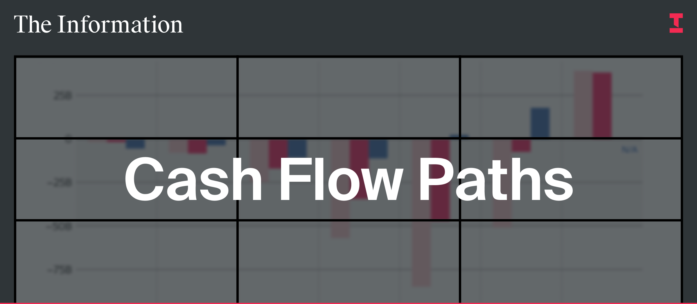
Cash Flow Paths
This chart maps how money moves between AI labs, cloud providers, chipmakers and investors, making it easier to see who benefits as AI spending grows.
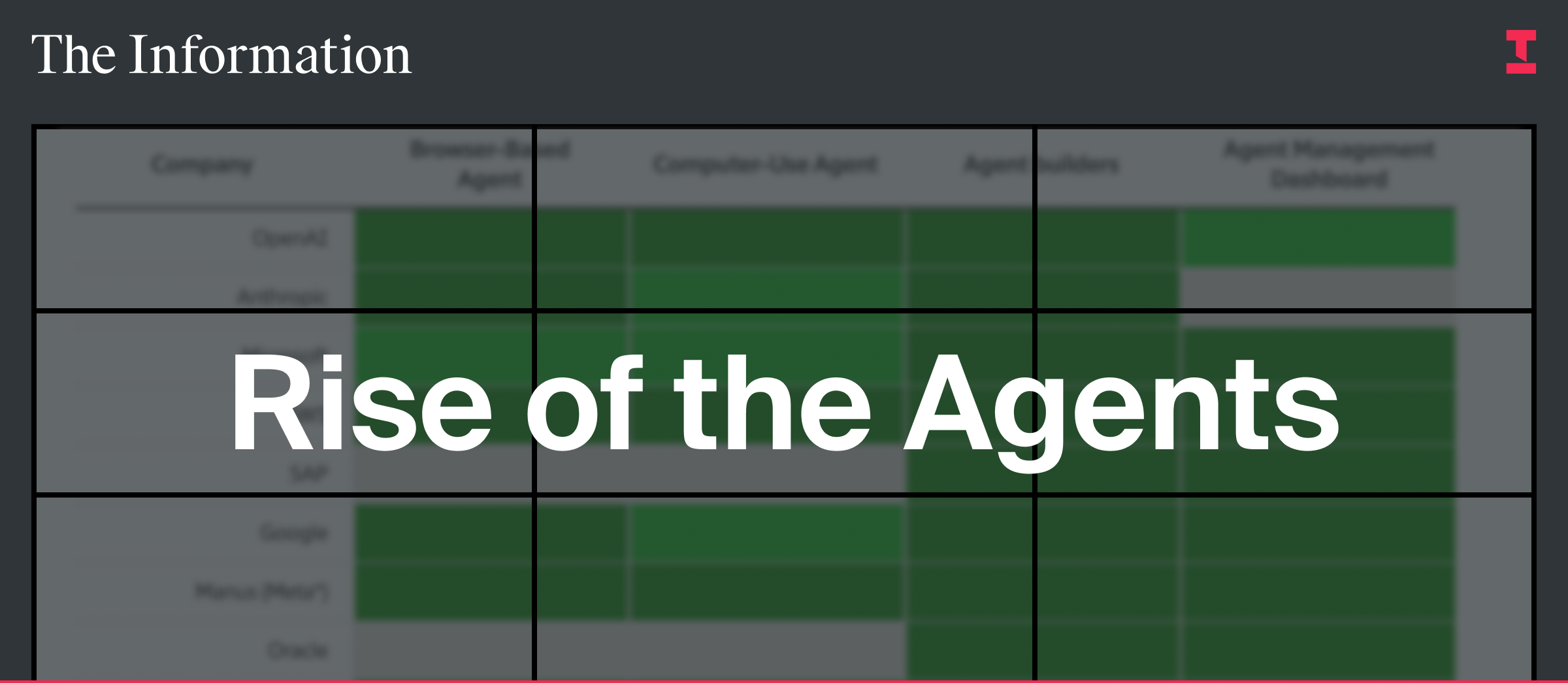
Rise of Agents
Agents have become one of AI’s biggest business bets. This chart shows how companies are positioning themselves around the shift from chatbots to more automated tools.
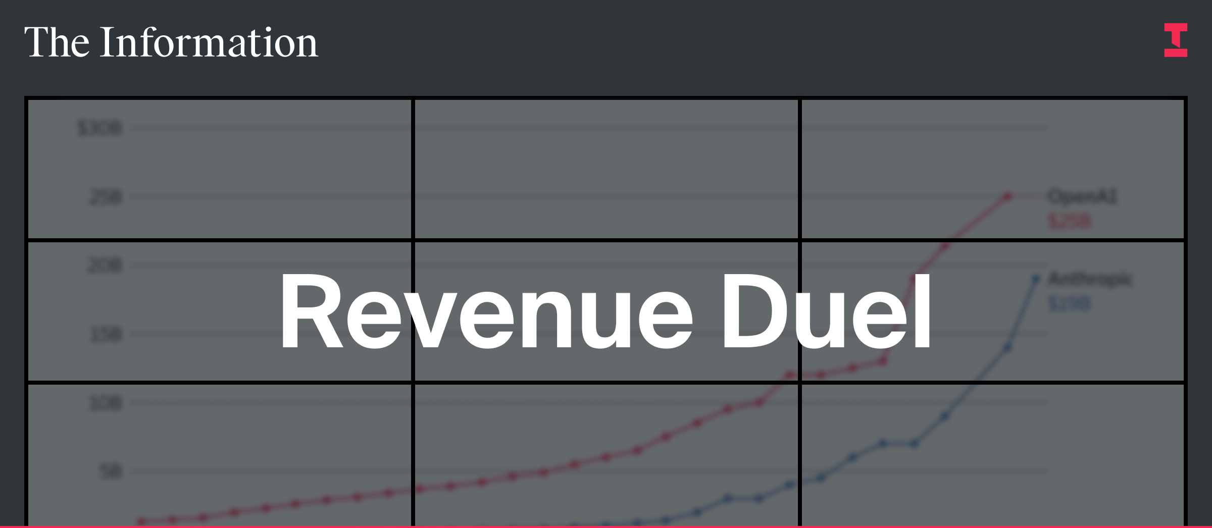
OpenAI and Anthropic’s Revenue Duel
This chart shows how quickly revenue is concentrating around OpenAI and Anthropic—and why their growth is becoming one of the clearest signals in the AI market.
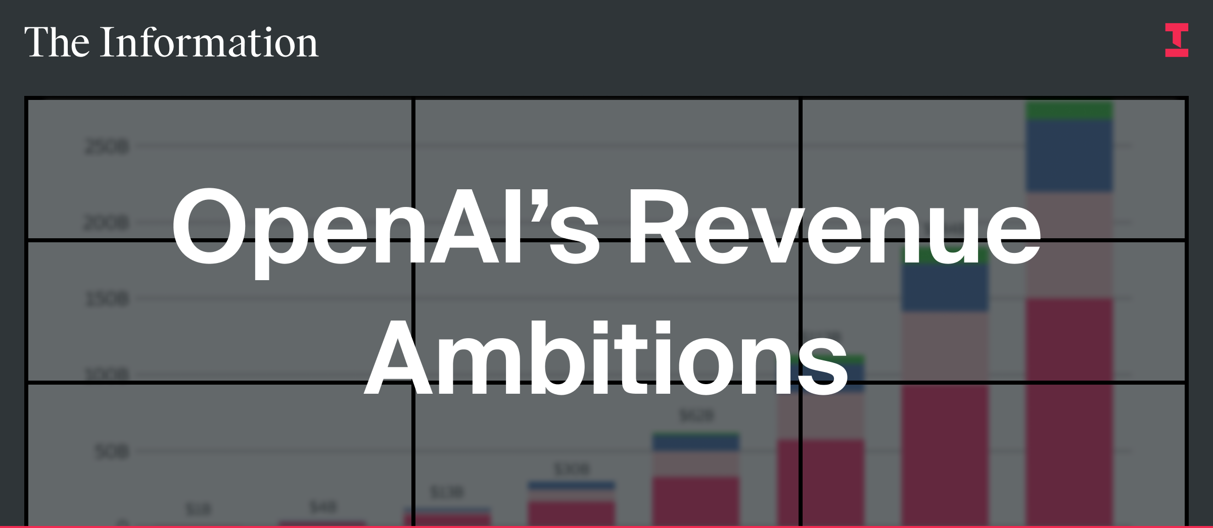
OpenAI’s Revenue Ambitions
OpenAI’s growth forecasts are rising fast, but so are its expected costs. This chart shows the scale of the company’s ambition and the cash burn behind it.
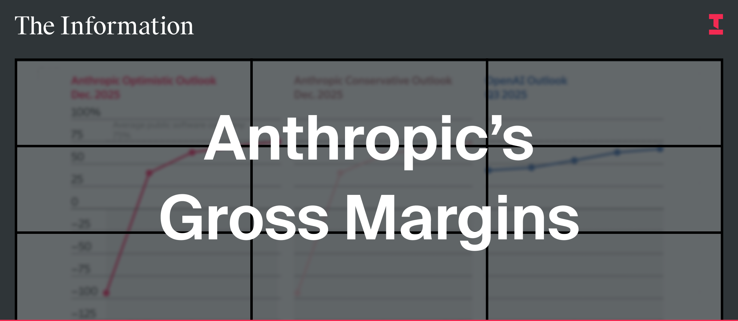
Anthropic’s Gross Margins
Anthropic’s revenue is growing quickly, but this chart shows why margins remain a key question as the company scales and spends more on compute.
Each chart lives on its own page and links back to the reporting behind it, making it easier to move from data to context.
At The Information, we break the stories that matter before they become mainstream. Catch up on the charts that explain tech’s first half.
Subscribe and get 25% off your Annual subscription
for $299.